Payment method logos widget
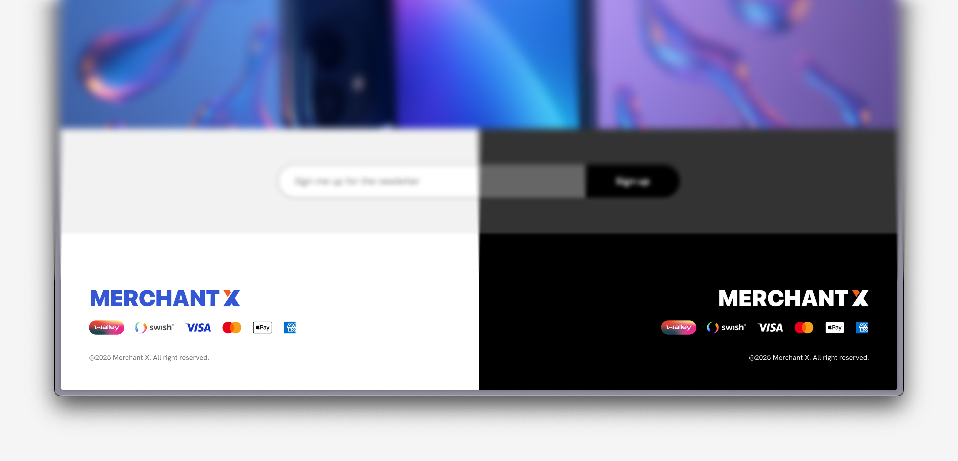
The Payment method logos widget can be placed on a merchant’s page to show customers which payment methods are available before they enter checkout. This helps build trust, increase transparency, and reduce drop-off by clearly communicating supported payment options.
The widget can be added to product pages, cart pages, or any other point in the purchase journey where you want to highlight payment alternatives.
Render the Payment method logos widget iframe
To display the widget, place the following script on the pages where you want it to appear.
By default, the widget will render as an iframe at the script’s position in the DOM. You can also use the data-container-id attribute to target a specific element where the widget should be injected.
<script
  src="https://api.uat.walleydev.com/walley-checkout-loader.js"
  data-token="widget-NO-EXAMPLEpU2ZnVG93cEVmVHdRb1RvaUFo..."
  data-widget="payment-method-logos"
></script>
Script element attributes
| Attribute | Required | Default | Explanation |
|---|---|---|---|
| src | Yes | - | See endpoints in Checkout Environment Endpoints |
| data-token | Yes | - | The widget token received when initializing the widget session. NB! The token should be reused for all widgets until it expires. |
| data-widget | Yes | - | The name of the widget. In this case payment-method-logos. |
| data-alignment | No | center | The alignment of the widget. Valid values are left, center, and right. |
| data-icon-size | No | small | The size of the icons displayed in the widget. Valid values are small, medium, and large. |
| data-dark-mode | No | false | Set this to true to enable dark mode styling for the widget. |